
What this guide answers
- How many sponsors is too many to display?
The home page has a ceiling: past roughly eight to ten logos, none of them registers, and your principal partner is financing wallpaper.
- A sponsor closed or stopped paying mid-season — when do we remove them?
A lapsed payment gets a conversation before a removal — small businesses hit rough patches, and a fortnight's grace with a friendly call preserves more relationships than an abrupt disappearance.
- Should we display sponsors on every page or just the home page?
A light site-wide presence (a compact strip in the footer, or the principal partner alone) plus a rich sponsor page is the pattern that serves both sides.
- What should we charge for website placement on its own?
Almost never sell it on its own — web placement is the connective tissue that makes the whole package demonstrable, and unbundling it invites sponsors to buy the cheapest visible slice.
USA edition. This guide is written for volunteer-run clubs in the United States. Where rules differ — grants, tax, incorporation, safeguarding — follow the USA-specific pointers below or check with your national body.
Somewhere on almost every club website is the graveyard: a strip of stretched, pixelated logos at the bottom of the home page, last touched in 2023, still featuring the plumber who stopped sponsoring two seasons ago next to the café that closed. Everyone agreed the sponsors should "go on the website"; nobody agreed what that meant, who maintained it, or what the sponsor was supposed to get from it.
This matters more than cosmetics. For most community clubs, sponsorship is the second-biggest income line after fees, and the website is the only sponsor benefit that works all year — the jersey is seasonal, the fence sign faces the car park, but the website is where every prospective member, every fixture-checker and every visiting team looks weekly. Displayed well, it is genuine advertising the club can point to at renewal time. Displayed as the graveyard, it teaches sponsors that the club's promises are decorative. (This guide is about the display; landing the sponsor in the first place is covered in how to get sponsors, and the season-long relationship in how to keep sponsors happy.)
Placement follows the tier — and the tiers must look different
If your club sells sponsorship in packages — gold, silver, bronze, or principal partner and friends-of-the-club — the website is where the difference between tiers becomes visible. A gold sponsor who paid five times bronze money and receives the same logo strip has been quietly told the tiers are fiction. The standard placement ladder, top to bottom:
- Principal / naming sponsor: a presence on the home page itself — a dedicated banner or hero mention, not just a logo among logos — plus first position everywhere sponsors appear. There should be exactly one of these, or the word "principal" means nothing.
- Gold (or major): large logo on the home page sponsor section, with a short blurb and link on the sponsor page.
- Silver / bronze: logo on the sponsor page, grouped by tier, smaller as the tiers descend.
- In-kind and friends: a text list on the sponsor page. The physio who strapped ankles for free deserves the mention; they do not need a logo the size of the principal partner's.
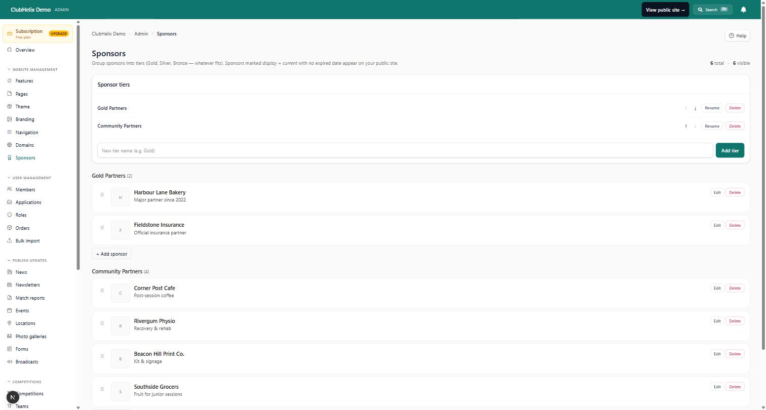
Whatever the ladder, apply it mechanically. The moment placement becomes negotiable per sponsor, every renewal becomes a design meeting. Write the placement into each package one line each — "gold: home page logo + sponsor page profile" — so the website obligations are as explicit as the invoice, and keep the register of who bought what somewhere the whole committee can see (sponsor management tooling exists for exactly this — sponsors, packages and what each was promised, next to the money).
The sponsor page: one page that does the selling
Beyond the home-page logos, build one proper sponsors page — linked from the main navigation, not buried in "About". Its audience is double: members deciding whose coffee to buy, and next year's prospective sponsors judging what their money would get. For each sponsor above the text-list tier:
- The logo, linked. Every logo clicks through to the sponsor's own site or profile. An unlinked logo is a sticker; a linked one is advertising.
- One human sentence. "Harbour Physio has kept our seniors on the park since 2019 — members get 10% off weekday appointments." Written by the club, warm, specific, mentioning any member offer. This sentence is worth more to the sponsor than the logo.
- The relationship's age. "Sponsor since 2019" costs nothing and signals to prospective sponsors that clubs keep their partners — which is precisely the fear a first-time sponsor has.
A page like this takes an evening in a page editor and then quietly sells sponsorship all year. When a prospect asks "what do we actually get?", the answer is a link, not a promise.
Beyond the page, weave sponsors into the content members actually read. A "player of the match presented by…" line in match reports and news posts, the sponsor's name on the event they funded, a thank-you post when a partnership renews. Contextual mentions outperform static logos because they appear where the eyeballs already are — and each one is a screenshot for the renewal email.
Logo hygiene — the unglamorous half
Most sponsor-display embarrassments are file-handling failures, not design failures:
- Ask for the real logo. Request a high-resolution file (ideally with a transparent background) from each sponsor when they sign — never screenshot their Facebook page. Sponsors have these files; nobody has ever been offended by being asked for their good logo.
- Never stretch, recolour or crop someone's brand. Display logos at consistent heights on a neutral background, with even spacing. If a logo arrives unusable, ask for another — guessing produces the pixelated graveyard.
- Alt text, every time. "Harbour Physio — gold sponsor" as the image's alt text is basic courtesy to members using screen readers and a small, real signal to search engines that the sponsor is associated with your club — part of why web placement has genuine value.
- Date-stamp the review. Sponsor logos are season-scoped content: at each season's start (and each renewal), one named person confirms the page matches the current sponsor register. The closed café comes down the week the sponsorship lapses, not two seasons later. The club's pre-season checklist is the natural home for the task.
On carousels: rotating logo sliders look lively but hide most sponsors most of the time — a sponsor who is invisible five-sixths of the time is right to wonder what they paid for. A static, well-ordered grid serves the sponsors better; save motion for the principal partner's banner if you use it anywhere.
Turn the display into the renewal
The display earns its keep in the renewal conversation, but only if the club collects the evidence as the season runs:
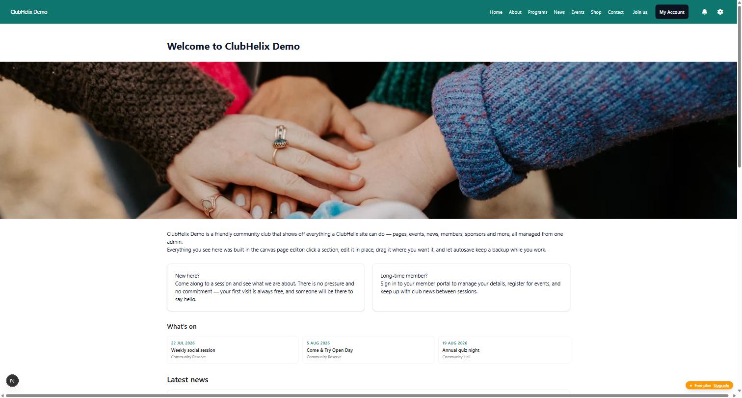
- Screenshot everything once a season. The home page with their logo, the sponsor page profile, the news post from their event. Renewal emails with pictures ("here is where you appeared this year") close at a visibly higher rate than renewal emails with adjectives.
- Report the reach you actually have. Website visits, newsletter subscriber counts, social followers — round numbers are fine. "Our site had 11,000 visits this season and your logo was on every page" is a real sentence a treasurer can say to a sponsor's owner.
- Mention click-throughs where you can see them. If your platform or analytics shows traffic leaving to sponsor sites, even roughly, that is the closest thing grassroots sponsorship has to a conversion metric.
The pattern across all of it: the website turns sponsorship from a donation into advertising, and advertising renews on evidence. Clubs that treat the sponsor display as a live obligation — placed by tier, maintained by name, evidenced by screenshots — walk into renewal conversations with something to show, which is the whole game. The deeper renewal playbook, including the mid-season check-in that pre-empts the "we're reviewing our sponsorships" email, is in how to keep club sponsors happy.
Frequently asked questions
How many sponsors is too many to display?
The home page has a ceiling: past roughly eight to ten logos, none of them registers, and your principal partner is financing wallpaper. The sponsor page has no practical limit if it is organised by tier — twenty sponsors grouped as two gold, five silver, nine bronze and a thank-you list reads as a healthy club, not clutter. If the home page is crowding, that is the signal to raise prices or add a tier, not to shrink the logos again: scarcity on the home page is exactly what makes the top package worth paying for.
A sponsor closed or stopped paying mid-season — when do we remove them?
A lapsed payment gets a conversation before a removal — small businesses hit rough patches, and a fortnight's grace with a friendly call preserves more relationships than an abrupt disappearance. A closed business comes down at the next content update as a simple matter of accuracy. Either way, act on the register, not on memory: this is why the sponsor list with payment status belongs in the club's admin next to the money, so "who should currently be displayed" is a report, not an archaeology project.
Should we display sponsors on every page or just the home page?
A light site-wide presence (a compact strip in the footer, or the principal partner alone) plus a rich sponsor page is the pattern that serves both sides. Site-wide-everything crowds every page and flattens the tiers; home-page-only wastes the fixture and news pages where members actually spend their time. Whatever you choose, the placement ladder should decide it per tier — the answer to "where does our logo go?" should be printed in the package, not improvised per sponsor.
What should we charge for website placement on its own?
Almost never sell it on its own — web placement is the connective tissue that makes the whole package demonstrable, and unbundling it invites sponsors to buy the cheapest visible slice. The exception is the genuinely digital-only partner (an online business with no interest in jerseys or fence signs); price that as a modest package of its own — logo, profile, a news mention — rather than a line item. For how the whole sponsorship offer should be priced and packaged, start from how to get sponsors for a sports club.

