
What this guide answers
- Is my club legally required to meet WCAG?
Disability discrimination law applies broadly to goods and services offered to the public, and the Human Rights Commission points organisations to WCAG as the benchmark — but community clubs aren't proactively audited…
- What's the single biggest accessibility win for a club website?
Fix your text: real headings in order, dark-enough colours, descriptive links, and information published as text rather than inside poster images.
- Do I need to hire an expert or buy tools?
Not for a club site. Free contrast checkers, your browser's zoom, and the keyboard-only test cover most of WCAG's practical ground, and an accessible template handles the technical layer underneath.
- What is alt text and when should I leave it empty?
Alt text is the short description a screen reader speaks in place of an image.
New Zealand edition. This guide is written for volunteer-run clubs in New Zealand. Where rules differ — grants, tax, incorporation, safeguarding — follow the New Zealand-specific pointers below or check with your national body.
A meaningful share of every club's community lives with disability, and many more people use your club website in "temporarily impaired" moments — bright sunlight on a phone at the ground, a broken reading arm, ageing eyes squinting at grey-on-white fixture times. An accessible club website isn't a legal nicety or a big-corporate concern: it's the difference between a member finding this Saturday's start time and giving up.
The good news is that website accessibility for clubs is mostly about a handful of everyday habits, not technical wizardry. The international standard — the Web Content Accessibility Guidelines, or WCAG — boils down for club purposes to a short list you can apply every time you publish. This guide covers that list in plain English.
What WCAG asks for, in one paragraph
WCAG (published by the W3C, the web's standards body — see w3.org/WAI) organises accessibility around four ideas: content must be perceivable (people can see or hear it — hence alt text, contrast, captions), operable (usable with a keyboard, not just a mouse), understandable (clear language, predictable navigation, labelled forms), and robust (works with assistive technology like screen readers).
Government websites in New Zealand are required to meet WCAG at level AA under the government's Web Accessibility Standard; community clubs aren't audited, but the same standard is the right target because it's simply what "everyone can use it" means in practice.
Here's how each idea lands on a club website.
Alt text: describe your images
Screen readers can't see your photos — they read out the image's alternative text ("alt text"). Every image editor and website builder has a field for it; most clubs leave it empty, which a screen reader renders as an unhelpful "image" or worse, the filename.
The habit: whenever you add an image, write one sentence saying what it shows and why it's there.
- Good: "Under-12s celebrating after winning the final, holding the trophy."
- Useless: "IMG_4032.jpg", "photo", or keyword-stuffing ("club football soccer team win").
- Decorative images — background textures, purely ornamental flourishes — should have empty alt text so screen readers skip them, not a description of the swoosh.
- Images containing information are the big trap. A training-schedule poster uploaded as a JPEG is invisible to a screen reader (and to Google). Post the schedule as real text on the page, with the poster as a bonus. The same goes for text baked into hero images.
If you're sourcing photos, our guide to free images for club websites covers where to find them — and every one you use needs alt text.
Colour contrast: grey-on-white is nobody's friend
Low-contrast text is the most common accessibility failure on club sites, usually arriving via club colours: gold text on white, light blue on grey, white on a busy photo. WCAG AA asks for a contrast ratio of at least 4.5:1 for normal text (3:1 for large headings) — as a rule of thumb, if you squint and the text melts away, it fails.
Practical fixes:
- Check your palette once. Free contrast checkers (such as WebAIM's, at webaim.org) take two colours and give you a pass or fail. Test your body text, buttons and link colours against their backgrounds.
- Club colours belong in accents, not body text. Keep paragraphs dark-on-light (or properly light-on-dark) and let the club gold live in banners, borders and buttons that pass contrast.
- Text over photos needs help — a dark overlay or solid panel behind it, not white text floating on a crowd shot.
- Never use colour alone to carry meaning. "Games in red are cancelled" fails for colour-blind visitors (roughly 8% of men); add the word "Cancelled" too.
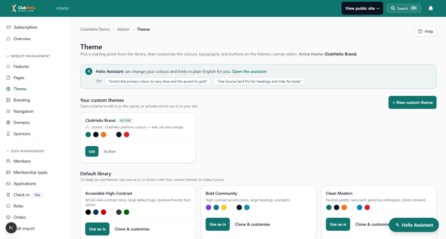
A theme system does the heavy lifting here: set an accessible palette once in your theme and branding settings and every page inherits it, instead of re-deciding colours in every banner.
In ClubHelix, the theme also refuses to save body text below 4.5:1 against the page background, so the most common failure can't reach your site by accident. Headings and body text can be given a smallest and largest size so they scale between a phone and a desktop. Whichever unit you type, the sizes are served in rem, so the text still follows a visitor's own browser text size.
Headings and structure: the skeleton screen readers navigate by
Sighted visitors skim a page by its visual layout; screen-reader users skim it by its heading structure, jumping from heading to heading. That only works when headings are real headings, used in order:
- Use actual heading styles (Heading 2, Heading 3) from the editor, not bold-and-bigger body text. Real headings are announced and navigable; bold text is just bold.
- Keep the order logical. One page title, then H2s for major sections, H3s beneath them. Don't pick a heading level because you like its size — that's what themes are for.
- Write descriptive headings and link text. "Training times" beats "More info", and a link that says how to build your club website beats one that says "click here" — screen readers often list a page's links out of context, where six "click here"s are meaningless.
- Prefer real text and lists to walls of centred italic text or content locked in PDFs. If it must be a PDF (a constitution, say), summarise the key points on the page as well.
Forms: labels, errors and keyboard access
Registration and contact forms are where accessibility failures actually cost your club members. The essentials:
- Every field needs a visible label — not just placeholder text that vanishes when you click. Placeholders also fail people with memory or attention impairments who lose track of what the half-filled field was asking.
- Mark required fields in words, not colour or an unexplained asterisk alone.
- Error messages must say what's wrong and where. "Something went wrong" strands people; "Please enter a phone number in the Emergency contact field" fixes it.
- The whole form must work by keyboard — tab between fields, submit with Enter. This comes free with well-built form tools and breaks with copy-pasted embed widgets, so test it: put the mouse away and try completing your own registration form.
If your forms are built in your website platform's own form builder rather than a third-party embed, labels, keyboard order and error handling are handled consistently — one less thing for a volunteer to get right by hand.
Captions, video and everything else
- Caption your videos. Match highlights, presentation-night speeches, coaching clips — captions serve deaf and hard-of-hearing members, plus everyone watching muted on a bus. Auto-captions on the major video platforms are a solid start; skim and fix names before sharing.
- Transcripts for audio. If your club records a podcast or audio announcements, post the text version too.
- Motion and flashing. Avoid auto-playing video with sound, and never publish rapidly flashing content — it's a seizure risk, and WCAG bans more than three flashes per second.
- Plain language everywhere. Short sentences, no jargon, expanded abbreviations on first use ("best and fairest (B&F)"). Accessibility and good writing are the same job. Our club website content ideas guide doubles as a plain-language checklist.

A 15-minute club website accessibility audit
Run this on your homepage, your fixtures or events page, and your registration form:
| Check | How to test it | Pass looks like |
|---|---|---|
| Alt text | Review each image's alt field | Every meaningful image described |
| Contrast | Run header, body and button colours through a checker | 4.5:1 or better for body text |
| Headings | View the page's heading outline | One title, logical H2/H3 order |
| Keyboard | Unplug the mouse; tab through the page and form | Everything reachable, focus visible |
| Links | Read link text alone | Each link makes sense out of context |
| Zoom | Zoom the browser to 200% | No lost content or overlapping text |
| Colour meaning | Look for colour-only signals | Words back up every colour cue |
| Video | Open your latest video | Captions present and roughly correct |
Book the audit into the club calendar once a season — accessibility drifts as volunteers add pages, and a regular sweep catches it early.
If you'd rather start from a foundation that's already accessible, ClubHelix templates are built with contrast-checked palettes, proper heading structure, labelled forms and keyboard navigation out of the box — and we run automated accessibility checks on our templates as part of our engineering process (see how we approach quality and safety on our security page). Your job shrinks to the content-level habits above: alt text, plain language and sensible headings. You can start free and inherit the rest.
Frequently asked questions
Is my club legally required to meet WCAG?
Disability discrimination law applies broadly to goods and services offered to the public, and the Human Rights Commission points organisations to WCAG as the benchmark — but community clubs aren't proactively audited the way government sites are. Treat WCAG AA as the right standard because it serves your members, with legal comfort as a side benefit.
What's the single biggest accessibility win for a club website?
Fix your text: real headings in order, dark-enough colours, descriptive links, and information published as text rather than inside poster images. That one sweep helps screen-reader users, older members, phone users in sunlight and your search ranking all at once.
Do I need to hire an expert or buy tools?
Not for a club site. Free contrast checkers, your browser's zoom, and the keyboard-only test cover most of WCAG's practical ground, and an accessible template handles the technical layer underneath.
What is alt text and when should I leave it empty?
Alt text is the short description a screen reader speaks in place of an image. Write it for any image carrying meaning (photos, posters, sponsor logos), and leave it deliberately empty for purely decorative images so screen readers skip past them.


