
What this guide answers
- How much does a club logo cost?
Anywhere from free (DIY roundel or monogram from a template) to a few hundred dollars for a commissioned mascot mark or crest from a freelance designer.
- Can we use AI tools or free generators for our club logo?
They're a legitimate way to explore directions cheaply, and for simple monograms and roundels the results can be perfectly serviceable.
- What size and format should our logo be for the website?
Upload the highest-resolution transparent PNG you have (or an SVG where supported) and let the platform scale it down — never scale a small file up.
- Should junior clubs and senior clubs share a logo?
Yes — one badge, one identity, is worth far more than "cooler" variants per section.
USA edition. This guide is written for volunteer-run clubs in the United States. Where rules differ — grants, tax, incorporation, safeguarding — follow the USA-specific pointers below or check with your national body.
A club logo has a harder job than most corporate branding ever faces. It has to work embroidered on a polo, printed on a cheap water bottle, shrunk to a favicon, blown up on a banner, photocopied in black and white on a school newsletter, and stitched onto a junior's uniform — and it has to do all that for decades, because clubs that change logos every few years never build the recognition that makes a badge mean something.
The good news: club logos are a well-solved design problem. You don't need an agency; you need to pick a proven style, follow a handful of rules, and insist on the right files at the end. This guide covers all three.
First, decide what the logo has to say
Before any drawing: three inputs, all of which you should already have if you've worked through choosing your club name:
- The name and nickname. The logo's main job is making the name visual. Kestrels get a kestrel; Rovers get something that moves; the Two Blues get, well, two blues.
- The colours. Two colours, maybe three. More than three and every printed item gets dearer and every embroidery quote gets worse. If your colours aren't settled, settle them now — they're a founding decision that outlasts committees.
- The feeling. Heritage club or modern franchise? A century-old-feeling crest and a sharp geometric mark are both great; a logo stuck halfway between usually isn't. Pick a lane.
Write these down as a one-paragraph brief. Whether you DIY or commission, the brief is what stops the process wandering.
The four club logo styles that always work
Practically every good club badge is one of these:
The crest or shield
The classic. A shield outline, the club initials or mascot, the founding year, maybe a scroll with the name. Reads as established and traditional from the day it's drawn — which is exactly why brand-new clubs love it. Its weakness: crests get cluttered fast. Keep to one focal element inside the shield.
The mascot mark
A drawn animal or figure — full-bodied for banners, or just the head for embroidery and favicons. The strongest choice for junior clubs (kids adore a mascot) and the most chantable-at-a-glance. Insist on a version that stays recognisable at 20 millimetres wide; detailed illustration collapses at embroidery scale.
The monogram or lettermark
The club initials, well-typeset, often inside a simple circle or shield. The most durable and cheapest-to-reproduce style there is, and the right answer when your club name has no obvious visual (Districts, United, Old Collegians). The whole game is typography: one strong typeface, generous spacing, no gimmicks.
The roundel
Text around a circle ("NORTHSIDE TENNIS CLUB • EST. 2026") with a simple symbol in the centre. Loved by community clubs because it carries the full name legibly, works at every size, and looks equally right on a flag, a website header and a coffee mug.
Steal the conventions of your sport, too — there's a reason football badges look like football badges. A logo that follows its sport's visual traditions gets instant legitimacy on a fixture list full of established clubs.
The rules that keep a logo usable
Whichever style you pick, these rules are non-negotiable — they're the difference between a logo and a picture:
- It must work in one colour. Black on white, white on black. Newsletters, engraving, embroidery quotes and sponsor documents will all demand it. If the design dies in mono, it's not done.
- It must survive being small. Test at 16 pixels (favicon) and 20 millimetres (embroidered chest badge). Fine linework, thin type and photographic gradients all die here.
- Flat colours, not effects. Drop shadows, bevels and gradients look dated fast and print terribly. Solid shapes and clean edges age gracefully.
- Round numbers of colours. Two spot colours plus black/white keeps every quote — screen printing, embroidery, signage — sane.
- Legible name or initials. From five metres away on a playing shirt. If you can't read it, it's decoration, not identity.
- Nothing borrowed. No traced professional-league badges, no clip-art mashups, no fonts your licence doesn't cover. A copied logo can force a humiliating rebrand years later, once it's on two hundred playing shirts.
If you want to be thorough, a quick search of the USPTO's trademark database will tell you whether a name-and-badge combination in your sport is already protected — five minutes now beats an attorney's letter later.

DIY, commission, or crowdsource?
Three honest routes, and the right one depends on your people, not your taste:
DIY with modern tools. Free and cheap design tools produce genuinely respectable roundels and monograms from templates — and for those two styles, templates are fine, because the styles themselves are conventions. Budget: roughly nothing. Risk: template sameness, and nobody owning source files. Fine for a social club; workable for a sporting club that picks simple.
Commission a designer. A freelance designer — or that member who does design professionally, engaged properly with a brief and a thank-you fee rather than guilt-tripped — will run you a few hundred dollars for a mark done right. This is less than one set of match balls, amortised over decades. It's the right call for mascot marks and crests, which punish amateur drawing.
Run a member competition. Tempting for engagement, risky for quality and feelings. If you do it: competition for concepts, committee picks a direction, and a designer (paid) produces the final artwork. Announce that process upfront so the winning ten-year-old's crayon kestrel becomes "the inspiration for" rather than "the file we sent the embroiderer".
Whatever the route, get member buy-in on the shortlist the same way as the name vote: two or three candidates, each mocked up on a playing shirt and a website header, one vote, done.
The files to demand (this is where clubs get burnt)
The single most common club branding disaster: the logo exists only as a small JPEG from 2019, the person who made it is gone, and every reprint looks worse. When the design is finished, insist on receiving all of:
- Vector source files (SVG, plus the native design file) — infinitely scalable; what printers and embroiderers actually want. This is the club's crown jewel.
- A transparent-background PNG at high resolution — for the website, documents and socials.
- A one-colour version (black, and white) — see the rules above.
- A horizontal lockup (logo beside name) and the square/circular mark alone — websites and social platforms need both.
- The colour codes — the exact hex values (and thread colours if embroidery was matched). Write them into your committee handover document.
Store the lot in club-owned storage, not a volunteer's personal drive — same rule as the domain and the bank account.
Put it to work everywhere, consistently
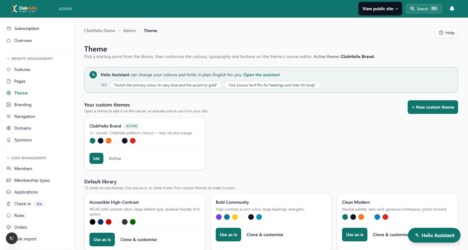
Consistency is what turns a logo into a brand: same mark, same colours, everywhere, for years. The easiest place to enforce that is your digital presence — with club theming, you upload the logo and set your exact colour codes once, and every page, button and heading on your club website follows automatically. No volunteer ever eyedroppers "roughly our blue" again.
Beyond the website: put the mark on your registration forms and member communications, your event banners, your email footer, and — the cheap wins — a flag for the ground and a pop-up banner for registration days. A season of relentless consistency does more for recognition than any redesign ever will.
Frequently asked questions
How much does a club logo cost?
Anywhere from free (DIY roundel or monogram from a template) to a few hundred dollars for a commissioned mascot mark or crest from a freelance designer.
The trap isn't the price — it's paying anything without receiving vector source files, one-colour versions and the exact colour codes. Files, not pixels, are what you're buying.
Can we use AI tools or free generators for our club logo?
They're a legitimate way to explore directions cheaply, and for simple monograms and roundels the results can be perfectly serviceable. Two cautions: check the tool's licence actually permits your use (some restrict commercial rights), and test the output against the usability rules — one colour, tiny sizes, embroidery — because generated art routinely fails exactly there. For a mascot or crest you'll keep for decades, finishing the artwork with a human designer is money well spent.
What size and format should our logo be for the website?
Upload the highest-resolution transparent PNG you have (or an SVG where supported) and let the platform scale it down — never scale a small file up. You'll want the square mark for favicons and social avatars and the horizontal lockup for headers. If you only have a JPEG on a white box, getting the mark redrawn as a vector is a small job for any designer and permanently fixes every future use.
Should junior clubs and senior clubs share a logo?
Yes — one badge, one identity, is worth far more than "cooler" variants per section. Differentiate with words ("Juniors", "Masters") and colourway variations under the same mark. The whole point of a club badge is that the eight-year-old and the veteran are wearing the same thing.
Logo done? Make it official everywhere at once — ClubHelix's theming applies your badge and exact colours across your whole club site, with your own domain on the front. Start free.

