
What this guide answers
- Should every page on a club website have a sidebar?
No. Content pages such as Home, Membership, Training, About and Contact usually benefit from one.
- Left sidebar or right sidebar?
Right, for most clubs. Visitors read the main column first, and a right sidebar keeps it where the eye starts.
- How many sections should a club website page have?
As many as the page needs and no more. Most good club pages have between five and ten sections in total.
- What happens to the sidebar on a phone?
It moves below the main content, in the same order. That is why the main column should make sense on its own: on a phone it is all a visitor sees before scrolling.
- Will a sidebar section go out of date?
Only if it holds typed-in information. Sections that read your data, such as events, membership prices, programmes, teams, ground status, upcoming classes and fixtures, stay current as you update the rest of your admin.
USA edition. This guide is written for volunteer-run clubs in the United States. Where rules differ — grants, tax, incorporation, safeguarding — follow the USA-specific pointers below or check with your national body.
Most club websites have the right information and the wrong layout. The training times are there, but three screens down, under a history of the club. The membership fees are there, in the fourth paragraph of the About page. The contact email is in the footer, in grey, at 12 pixels.
Nobody sets out to build a page like that. It happens because a page gets written top to bottom, like a letter, and then things get added to the end. This guide is about the other way to build a page: decide what the page is for, put that in the main column, and put everything a visitor might want next in a sidebar beside it. It covers the building blocks, the layouts that work for the pages every club has, and the mistakes that make a page harder to use.
The examples use ClubHelix's page builder, which has forty-five section types and sidebars of up to eight sections on each side, but the thinking works on any platform.
The two columns, and what each is for
A club page with a sidebar has two jobs running side by side.
The main column tells the page's story. On a membership page, that is what membership includes and how to join. On a training page, it is who the sessions are for and what to bring. A visitor who reads only the main column should leave knowing what the page promised.
The sidebar answers "what next?" It is for the things a visitor on this page is likely to want immediately after, or instead: the next three events, the email address to ask a question, a button to join, today's ground status, links to the related pages. Sidebar content is short, scannable and useful on its own.
A good test: if you deleted the sidebar, would the page still make sense? It should. If you deleted the main column, would the sidebar still be useful? It should be, a little. When a sidebar section only makes sense after reading the main column, it belongs in the main column.
On a phone, the sidebar moves below the main content, so the order still holds: the page's story first, then the next steps.
The building blocks
Most club pages are built from the same dozen or so sections. Knowing what each one is good at saves a lot of wall-of-text pages.
For telling the story (main column):
- Text for anything that genuinely needs paragraphs. Keep it to a few short ones, with headings.
- Image and text for the "this is who we are" moment: one photo beside a heading, a few lines and a button.
- Cards for three or four parallel options, such as ways to get involved or age groups.
- Timeline for club history. A timeline of five milestones is read; six paragraphs of history are not.
- Stats for headline figures: members, teams, the year the club was founded.
- Quote for a member's words. One real sentence from a parent does more than a paragraph of "we're a friendly club".
- FAQ for the questions people actually ask, as answers that open and close.
For practical information (either column):
- Training times as a table, or a list grouped by day when it sits in a sidebar.
- Membership prices that fill themselves in from your membership types, each with a join button.
- Programmes, Teams and Shop products, which list what you already manage elsewhere and link to each one.
- Roles, which lists your committee and volunteer roles with who holds them, and can show which roles are vacant.
- Contact details, Social links and Quick links.
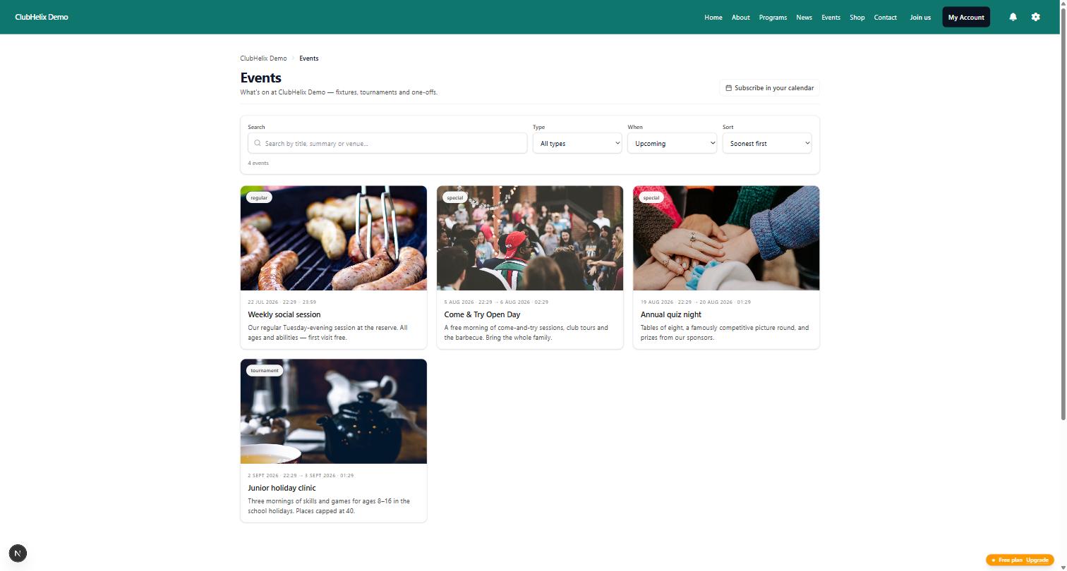
- Events, News, Locations and Sponsors, which update themselves as you publish.
- Upcoming classes, Passes & punch cards, Test days and Test levels, read from your programmes and testing ladder, so a class time or a pass price is never typed twice.
- Fixtures & results and Competitions, from your own competitions, each linking to the competition page.
- Book a facility, Forms, Donate and Raffles, for the things a visitor can do right now: book a court, fill in a form, give or buy a ticket.
- Latest galleries, Newsletters, Match reports and Member clubs, which list what you have already published.
For timely messages:
- Notice, in information, good news, warning or urgent tones, for "training moved this week".
- Ground status, which shows your open, wet-weather or closed call while it is live and disappears when it expires.
- Call to action, a headline with one or two buttons, for every "join us" and "come and try".
The sections that fill themselves in from the rest of the platform are the ones that stop a page going stale. A fees paragraph typed in February is wrong by July; a membership prices section is right because it reads the prices you charge.
What earns a place in the sidebar
A sidebar is narrow, around 280 pixels on a laptop. That shapes what works there. Good sidebar sections are short and have a clear action:
- Upcoming events, three to five of them, in a compact list.
- Contact details, with the email and phone number as tappable links.
- Quick links to the pages a visitor on this page usually wants next.
- Training times, grouped by day.
- Ground status on any club that makes wet-weather calls.
- A call to action to join, register or come and try.
- Social links and Sponsors.
- Upcoming classes, Fixtures & results or Test days, a short list of what is coming up next.
- Donate or Raffles, one appeal with its button.
Things that rarely work in a sidebar: long text, a full photo gallery, a form with more than three or four fields, and anything the visitor has to read before the main column makes sense.
Eight sections per side is a ceiling, not a target. Three or four well-chosen sections beat eight that push the useful ones below the fold.
Page-by-page layouts that work
These are starting points. Change them to suit your club, and leave out anything you cannot fill with real information.
Home page
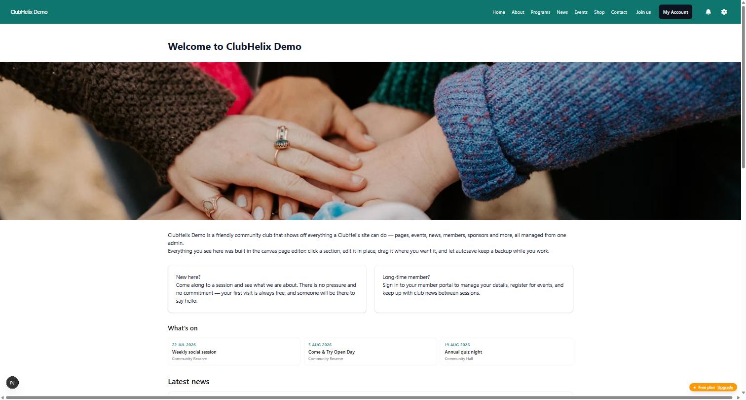
- Main column: a banner image across the top, an image-and-text welcome, a stats strip, the latest news, and a call to action to join.
- Right sidebar: ground status, upcoming events, quick links (Join, Training, Contact), sponsors.
A banner at the top of the page stays full width, and the sidebar starts underneath it, so you do not have to choose between a hero image and a sidebar.
To make one main-column section stand out, give it a section style instead of adding another section: a hero for the opening banner, or an accent band in your brand colour for the call to join.
Membership or Join page
- Main column: a short paragraph on what membership includes, membership prices with join buttons, and an FAQ (Can I try before I join? Is there a family discount? What does the fee cover?).
- Right sidebar: contact details for the registrar, training times, a quote from a member.
Training page
- Main column: who each session is for, what to bring, and a training times table.
- Right sidebar: a notice for any change this week, locations with directions, ground status, a call to action to come and try.
About and committee page
- Main column: image and text about the club, a timeline of its history, and a roles section listing the committee.
- Right sidebar: contact details, quick links to your constitution and policies, social links.
Tick Show vacant roles on the roles section and point it at your volunteer page. A committee page that says "Treasurer: vacant, interested?" recruits volunteers every week without anyone writing a post.
Contact page
- Main column: a short contact form and your locations.
- Right sidebar: contact details, social links, an FAQ of the three questions people most often email about.
Common layout mistakes
Everything in one long column. Twelve sections stacked vertically is a page nobody finishes. Move the practical, standalone items into a sidebar and the main column shortens by half.
A sidebar that repeats the navigation. If your sidebar is just links to the same pages as your menu, it is using the most valuable space on the page to say nothing new. Link to the pages a visitor on this page needs next.
Information that goes stale. Typed-in fees, typed-in fixtures, "next event: 14 March". Where a section can read the real data (prices, programmes, events, teams, ground status), use it.
Invented detail. Never fill a section with placeholder phone numbers or made-up quotes to make the page look complete. An empty section in ClubHelix simply does not appear on the live page, so leaving one out costs nothing.
No way to act. Every page should end in something to do: join, come along, get in touch, volunteer. If a page has no button, add a call to action.
Sections that repeat, and sections not everyone sees
Some sections belong on many pages: a sponsor strip, a "come and try" call to action, a link to your code of conduct. Build them once rather than on every page. A saved section is a copy you can adapt wherever you place it. A synced section stays the same everywhere, so one edit updates every page that uses it. Governing bodies can ask the clubs below them to place a synced section, such as a child-safe notice or a national sponsor bar: each club places it on its own pages, and the governing body sees only how many clubs have done so.
For content that should sit around the built-in pages rather than on a page you built, use shared regions: sections before or after every news post, event, team and programme, a band above the footer on every page, and a shared sidebar beside single news posts, events, teams and programmes. A page you built keeps its own sidebar setting, so the shared sidebar never replaces it.
A section can also be shown only to members, or only to visitors who are not signed in, which suits a "Join us" band that members don't need. Members-only content is never sent to anyone else, but a synced section is always public, so keep private material out of one. Limiting a section to phones or desktops is a layout choice, not a privacy setting. Our guide to members-only content covers what belongs behind a login.
Building it without a web developer
In ClubHelix you build all of this on the page itself: click a section to edit it, drag it into the sidebar or back, and preview before you publish. A page holds up to forty sections, and the counter at the top warns you as you get close. The canvas page editor page shows the editor in more detail, and our guide to building a sports club website covers the site as a whole: which pages to create, domains and costs.
If you would rather describe the page than build it, the built-in assistant can draft a layout along these lines for you to review before anything goes live. When you are ready to try it, create your club's site.
Frequently asked questions
Should every page on a club website have a sidebar?
No. Content pages such as Home, Membership, Training, About and Contact usually benefit from one. A page that is a single form, a full photo gallery or a long document is better as one column, so the content has the full width.
Left sidebar or right sidebar?
Right, for most clubs. Visitors read the main column first, and a right sidebar keeps it where the eye starts. Use both sidebars only on wide pages with a lot of genuinely useful secondary information, such as a match-day hub.
How many sections should a club website page have?
As many as the page needs and no more. Most good club pages have between five and ten sections in total. ClubHelix allows up to forty, which gives room for long reference pages, but a page that reaches that many is usually two pages.
What happens to the sidebar on a phone?
It moves below the main content, in the same order. That is why the main column should make sense on its own: on a phone it is all a visitor sees before scrolling.
Will a sidebar section go out of date?
Only if it holds typed-in information. Sections that read your data, such as events, membership prices, programmes, teams, ground status, upcoming classes and fixtures, stay current as you update the rest of your admin. Review typed-in sections, such as training times and contact details, at the start of each season.

