
What this guide answers
- What makes a club website look professional?
Four things, none of which are fancy: current information (the single biggest tell, in both directions), consistent branding (one logo, exact club colours everywhere — a theme system enforces this automatically), real…
- What pages should a club website have?
The essential four: a homepage that says what/where/for-whom with a join button, a join page with published fees and a real registration form, fixtures or a calendar, and a contact page with role-based emails.
- How do I see real examples of club websites?
Three good sources: the ClubHelix demo club linked above (a complete site you can click through today), the websites of the biggest clubs in your own league (steal structure, not content), and the affiliated-clubs…
- Should our club website look like the big professional clubs' sites?
Borrow their conventions, not their scope. Professional club sites are run by content teams publishing daily — copying their twelve-section mega-menus onto a volunteer-run site produces exactly the stale sprawl this…
UK edition. This guide is written for volunteer-run clubs in the UK. Where rules differ — grants, tax, incorporation, safeguarding — follow the UK-specific pointers below or check with your national body.
Search for club website inspiration and you'll mostly find galleries of pretty screenshots with no explanation of why those sites work — which is the only part a committee can actually use. So this guide does it differently. Having seen a lot of club websites — the great, the stale and the "last updated 2019" — we've found that every genuinely effective one is a strong version of one of six archetypes.
For each archetype below: what it is, who it suits, the specific patterns it nails, and the trap that ruins it. None of this requires naming (or shaming) real clubs — the patterns are what matter, and every one of them is stealable for your own site. If you want the full build process, pair this with our step-by-step website guide.
1. The recruiter
The site built to convert interest into members. Everything above the fold answers a prospective member's questions in order: what you offer, where, for whom, what it costs, and a join button you couldn't miss from across the room.
What the best recruiter sites nail:
- A headline that does real work. "Junior and senior hockey on the city's north side — new players always welcome" beats "Welcome to our website" by a country mile, on the page and in search results.
- Fees published, plainly. Prospective members comparison-shop. The clubs that hide fees behind "enquire now" lose the comparison by default.
- A real registration form, not an enquiry form — pay, sign, done in one sitting, because every manual step between interest and membership leaks people.
- Social proof with faces. Genuine photos of ordinary members (not just the trophy-winning senior team) tell a newcomer "people like me belong here".
The trap: recruiting so hard the site's useless to existing members, who are 95% of your traffic. Even a recruiter site needs fixtures and contacts one tap away.
Steal it if: you're a growing club, a new club, or any club whose junior intake pays the bills.
2. The community hub
The site that's the village hall in digital form. News on the homepage weekly, photo galleries after every fixture, a calendar dense with club workdays, quiz nights and the end-of-season dinner, life-member tributes done properly. These sites make a club feel like an institution — which, in a club with a hundred years behind it, it is.
What the best hubs nail:
- Freshness you can see. Dated news posts, this week's results, next week's events. A visitor can tell in three seconds the club is alive — and that freshness is itself the message.
- Distributed authorship. One volunteer can't feed a hub. The clubs that manage it give each team manager a login to post match reports directly — a news system with per-author permissions rather than a single overworked webmaster forwarding emails.
- History given a home. Honour boards, premiership timelines, "50 years in photos". Cheap to build once, and disproportionately loved.
The trap: starting at hub ambition and abandoning it by round six — a homepage whose latest news is four months old actively signals decline. Start with the recruiter's four pages; earn your way to hub cadence.
Steal it if: you're an established club with real volunteer depth and a story to tell.
3. The match-day HQ
The site players and parents check every single week. Its centre of gravity is this weekend: fixtures, times, venues with tap-for-directions maps, team selections, ladders and results — accurate, mobile-first, findable in seconds.
What the best match-day sites nail:
- The ten-second test. A parent at work on Friday finds Saturday's time and venue in under ten seconds, on a phone, without logging in.
- Self-updating sport data. Ladders and results that publish as a side-effect of running competitions — not a volunteer retyping tables into a webpage on Sunday night, which is precisely the job that stops getting done in August.
- Wet-weather protocol. One consistent, prominent place for cancellations, updated the same way every time, so nobody's refreshing three social feeds at 7am.
The trap: stale data is worse than no data — a wrong venue sends a family to the wrong ground. If a page can't be kept accurate automatically, the best clubs don't publish it.
Steal it if: you run multiple teams across multiple venues — junior football, rugby, netball, cricket.
4. The shopfront
The site that funds the club while nobody's watching. Merchandise with real product photos and size guides, event tickets, raffle entries — the clubs doing this well have turned the website from a noticeboard into a revenue line.
What the best shopfronts nail:
-
A real cart and real payment, with sizes, stock and pickup notes — an actual club shop, not a PDF order form emailed to the uniform coordinator.
-
Seasonal rhythm. The hoodie drop lands in August as pre-season starts and the evenings draw in; end-of-season dinner tickets go on sale the week the league finishes in May. Merchandising is timing — and the Christmas window in the middle of your season is the single best merchandise fortnight of the year, which clubs on a summer-sport calendar never get.
-
The uniform pipeline. New-member kit bundled into the registration flow itself, so the sign-up that just happened also sorted the socks.
The trap: shopfront polish on top of recruiter neglect — if the shop is slicker than the join page, priorities are inverted. The shop funds the club; the join page is the club.
Steal it if: you have an active supporter base, a strong identity, or uniforms to move every season.
5. The sponsor magnet
The site that pays for itself in one sponsorship renewal. Sponsors get named tiers, clean logo placement site-wide, a click-through link and a genuine thank-you story — and the club gets a professional shopfront to sell next year's packages against.
What the best sponsor-magnet sites nail:
- Tiered, consistent placement — principal partner in the header or hero, gold on every page footer, bronze on the sponsors page — matching exactly what the sponsorship packages promised, automatically, via site-wide sponsor placements.
- Proof for renewals. "Your logo appeared on every page of a site with X visits" is a renewal conversation that sells itself; the best clubs screenshot and send it unprompted.
- Sponsors woven into content — "Player of the match, presented by the Main Street Bakery" — not quarantined on one forgotten page.
The trap: a cluttered fruit-salad of forty logos. Fewer sponsors, presented beautifully, at higher prices — the website should make sponsors feel exclusive, not listed.
Steal it if: local business sponsorship is a meaningful slice of your budget (for most senior clubs, it should be).
6. The minimalist
The one-page-that's-always-right. Some of the best club websites are the smallest: what, where, when, fees, join button, contact — immaculately current, nothing else. Common among social clubs, single-team clubs and community groups, and quietly superior to nine-tenths of bloated club sites.
What the best minimalist sites nail: brutal scope honesty (they publish only what they'll maintain), instant load on any phone, and a join action front and centre. The trap: minimalism as neglect rather than discipline — five pages of "coming soon" is not a minimalist site; one finished page is. Steal it if: your volunteer bandwidth is one person, one hour, once a month — build our free-tier four-pager and stop there, proudly.
See the patterns live: a club you can click through
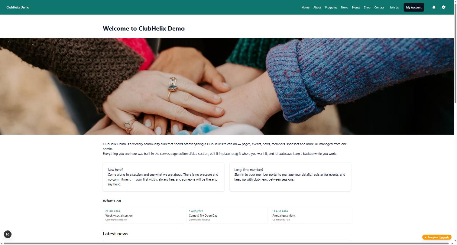
Reading patterns is one thing; clicking through them is better. The ClubHelix demo club is a complete, living club site — home, news, events, teams, shop — that you can explore right now at the demo, no account needed. It's a working recruiter/match-day hybrid: notice the join pathway from the homepage, the fixtures a tap deep, and the sponsor strip doing quiet work at the bottom.
The same patterns carry through the inner pages — dated news with authors, events with RSVP, teams with training times:
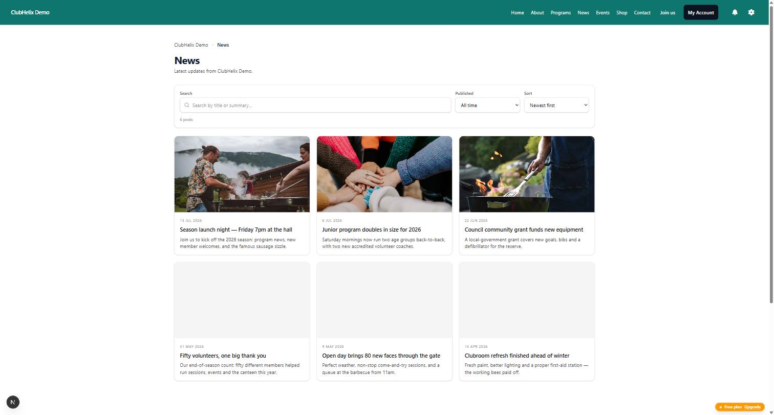
Every page of it was assembled with the same drag-and-drop editor and theming any club gets — which is rather the point: none of these archetypes require a developer anymore.
Choosing your archetype (and committing)
The failure mode isn't picking the wrong archetype — it's trying to be all six at once with one volunteer. The honest sequence for almost every club:
- Start as a recruiter — the four essential pages, finished and current.
- Add match-day HQ the moment you're running fixtures, but only the self-updating kind.
- Layer in shopfront or sponsor magnet when there's money on the table.
- Grow into a hub last, once volunteer depth exists — it's a cadence commitment, not a build.
And whichever you choose, apply the two tests every archetype shares: the ten-second phone test (can a stranger find your fees, and a member find this week's venue, in ten seconds on a phone?) and the freshness test (does anything visible prove the club was alive this week?). Pass both and your site is already better than most of the "inspiration galleries".
Frequently asked questions
What makes a club website look professional?
Four things, none of which are fancy: current information (the single biggest tell, in both directions), consistent branding (one logo, exact club colours everywhere — a theme system enforces this automatically), real photography of your actual club rather than stock imagery, and a mobile experience that doesn't require pinch-zooming. A modest site that nails these reads as more professional than an elaborate one that misses any of them.
What pages should a club website have?
The essential four: a homepage that says what/where/for-whom with a join button, a join page with published fees and a real registration form, fixtures or a calendar, and a contact page with role-based emails. Then add per your archetype — news and galleries for a hub, shop for a shopfront, sponsors page for a sponsor magnet. Full details in the build guide.
How do I see real examples of club websites?
Three good sources: the ClubHelix demo club linked above (a complete site you can click through today), the websites of the biggest clubs in your own league (steal structure, not content), and the affiliated-clubs directory published by the body above you — an instant gallery of your direct peers, good and bad.
For most clubs that directory sits on your county association's site, and it's usually the most complete list of comparable clubs you'll find anywhere.
Reviewing five peers' sites against the ten-second test is a genuinely useful committee exercise.
Should our club website look like the big professional clubs' sites?
Borrow their conventions, not their scope. Professional club sites are run by content teams publishing daily — copying their twelve-section mega-menus onto a volunteer-run site produces exactly the stale sprawl this guide warns about. What is worth borrowing: their relentless fixtures-first mobile design, their sponsor placement discipline, and their one-tap membership CTAs.
Pick your archetype and build it this week — ClubHelix gives you the editor, the theming and every pattern in this guide, ready to go. Start free or explore the demo first.


