
What this guide answers
- Why does our website font look different on my phone?
Usually because the site names a font but doesn't serve it, so your phone substitutes one it has.
- How many fonts should a club website use?
Two: one for headings and one for body text. One font in two weights also works well.
- Can we use the font from our club logo?
Only if the licence covers web use, which desktop licences usually don't.
- Do the hosted fonts support languages other than English?
They cover the Latin alphabet, which includes most Western European languages.
- What file do we need to upload our own font?
A WOFF2 file for each weight you want to use, such as regular and bold, and a licence that allows use on a website.
Ireland edition. This guide is written for volunteer-run clubs in Ireland. Where rules differ — grants, tax, incorporation, safeguarding — follow the Ireland-specific pointers below or check with your national body.
Colours get all the attention when a club sets up its website. Somebody holds the jersey up to the screen, the committee argues about the exact shade of maroon, and the fonts are left on whatever the template came with.
That is a missed chance. Type is on every page, in every heading, every fixture list and every button. The right fonts make a site feel like your club before anyone reads a word. The wrong ones make it look like a template, or worse, look different on every visitor's screen.
This guide covers why the font you picked is sometimes not the font your visitors see, how to choose a pair that suits a club, how to echo your logo without copying it, sizes that work on a phone, and what to check before you upload a font of your own.
The font you picked is not always the font they see
A web page doesn't carry its fonts inside it. It names a font, and the visitor's browser has to find it. If the website serves the font file itself, everyone sees it. If the page only names the font, the browser looks for it on the visitor's own device, and when it isn't installed, quietly substitutes something else.
That is why a club site can look right on the treasurer's laptop, which happens to have the font installed from a design course, and plain on every phone at the ground. Nobody notices until someone compares screenshots.
So the first rule is simple: choose from fonts your website actually serves. A good club platform will only offer fonts it can deliver to every visitor, or will clearly mark the ones it can't.
Choose two fonts, not five
Most good club sites use two fonts: one for headings, one for everything else. Some use one font in two weights. Almost none need three.
- The heading font carries the personality. It can be bold, condensed, a little unusual. It only has to be readable at large sizes.
- The body font carries the information: training times, fees, the registration form. It has to be plain, open and easy to read at small sizes on a phone.
Tall, condensed display fonts look great in a hero banner and are tiring in a paragraph. Keep them for headings and let a plain font do the reading work.
Pairings that suit a club
These combinations use widely available open-licence fonts, and each suits a different kind of club:
- Oswald headings with Open Sans body text. Condensed and sporty on top, friendly underneath. A safe choice for football, netball and most team sports.
- Bebas Neue headings with Inter body text. All-capitals headings with a scoreboard feel, over a very readable body font. Keep headings short, because Bebas Neue has no lower case.
- Montserrat headings with Source Sans 3 body text. Clean and modern, and works for almost any club.
- Playfair Display headings with Lato body text. More traditional: suits a rowing, golf, bowls or tennis club with a long history.
- Roboto Slab headings with Roboto body text. Solid and practical, with a slightly old-fashioned sporting feel from the slab serifs.
- Merriweather headings with Nunito body text. Warm and approachable, good for community, junior and social clubs.
If you are unsure, pick the body font first. A body font that reads well on a phone matters more than the perfect heading.
Echo your logo, don't copy it
It is tempting to use the logo's typeface across the whole site. Often you can't: logo fonts are frequently commercial, bought once by whoever designed the crest, and the licence rarely covers a website. Even when it does, a font designed for a crest is often poor for paragraphs.
A better approach is to echo the logo's character. If the crest uses a heavy, condensed capital, choose a condensed heading font. If it uses a traditional serif, choose a serif heading font. Visitors notice the family resemblance, not the exact letterforms. Our guide to designing a club logo covers the logo itself.
Sizes, spacing and the phone test
Fonts are only half of how text looks. The other half is size and space.
- Body text of at least 16 pixels. Anything smaller is hard work on a phone in the sun.
- Headings that scale with the screen. A heading that looks right on a laptop can wrap onto four lines on a phone. Setting a smallest and largest size, so headings shrink smoothly on small screens, fixes this without separate phone and desktop designs.
- Consistent space between sections. Pick one spacing for the whole site rather than adding gaps page by page. Tight spacing suits a busy news-led site; roomier spacing suits a site with big photos.
- Consistent cards. Event, news and contact cards should share one border and shadow style, so the site reads as one design.
Then do the phone test. Open the site on the cheapest phone on the committee, outside, and read the training times. If you have to squint, make the body text bigger. The accessible club website guide covers contrast and readable sizes in more detail.
Using your club's own font
Some clubs have a font that is genuinely theirs: a typeface the club commissioned, or one bought for the brand. Using it on the website can be worth it. Check three things first.
- The licence. A desktop font licence lets you use the font in documents and print. It usually does not let you put the font file on a website, where every visitor downloads it. Look for a "web" or "webfont" licence, or ask the foundry. If the font came with the logo, ask the designer what was bought.
- The file format. Websites use WOFF2 files. If you have TTF or OTF files, you will need to convert them, and the licence has to allow that too.
- The weights. You need a separate file for each weight you use, usually regular and bold. Without a bold file, the browser fakes bold text by thickening the regular one, which looks smudged.
If any of the three is a problem, choose the closest open-licence match instead. Nobody at the canteen will know the difference, and nobody will send the club a licence invoice.
Check it everywhere before it goes live
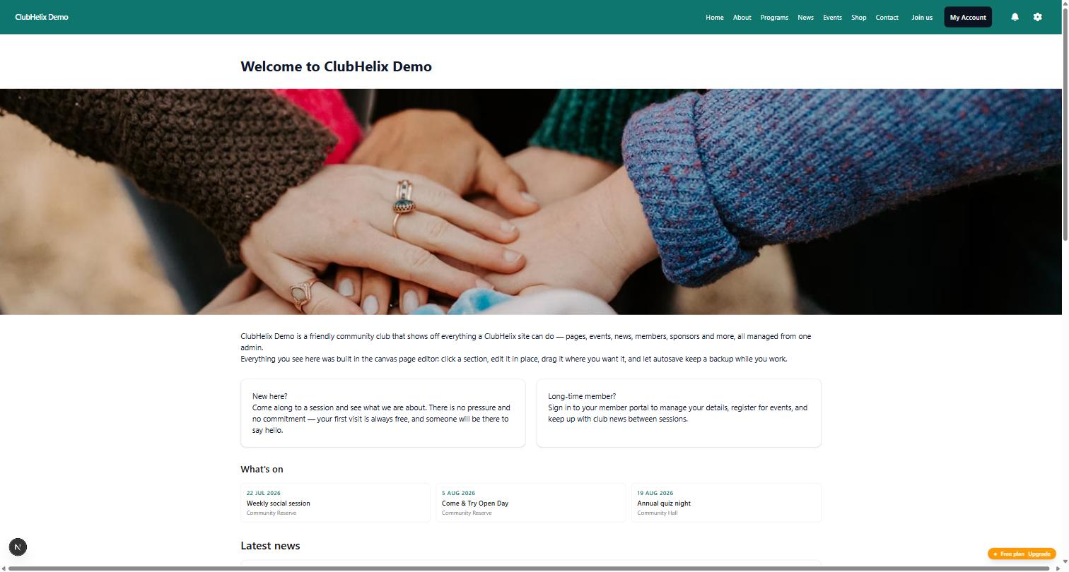
A font change touches every page at once, so preview it properly before you publish. Look at a page with long text, a fixture list, a form and a page full of buttons, not just the homepage hero. Check the phone view. Check the headings in your longest page title. If your platform can show every kind of section in the new style before you save, use it.
How it works in ClubHelix
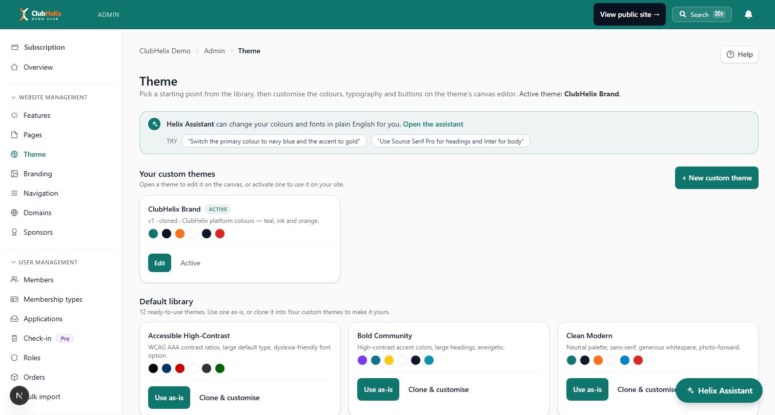
The theme editor offers around twenty open-licence font families, including every font named in the pairings above, plus the system fonts. Each one is served from our own servers, so every visitor sees the font you chose. Theme default at the top of the list puts a field back to the standard font.
On the Pro plan, you can upload your club's own fonts as WOFF2 files, up to 500 KB each, one file per weight. You confirm the club is licensed to use the font on a website before it uploads. If your organisation moves to a lower plan, uploaded fonts are kept but not used, and they return when you move back to Pro.
The same theme sets the space between sections, the shadow and border on cards, and the smallest and largest sizes for headings and body text, so they scale between a phone and a desktop. The Style book tab shows every kind of section you can add to a page in the theme you are editing, including changes you haven't saved yet. The themes and branding page covers everything the theme controls, and pricing shows what each plan includes. For styling beyond the theme, see our guide to custom CSS for club websites.
Frequently asked questions
Why does our website font look different on my phone?
Usually because the site names a font but doesn't serve it, so your phone substitutes one it has. Choose a font the website delivers itself, and it will look the same on every device.
How many fonts should a club website use?
Two: one for headings and one for body text. One font in two weights also works well. More than two usually looks messy and slows the page down.
Can we use the font from our club logo?
Only if the licence covers web use, which desktop licences usually don't. If it doesn't, pick an open-licence font with a similar feel for headings and keep the logo itself as an image.
Do the hosted fonts support languages other than English?
They cover the Latin alphabet, which includes most Western European languages. The hosted fonts come in upright styles, and italics are drawn by the browser from the upright style.
What file do we need to upload our own font?
A WOFF2 file for each weight you want to use, such as regular and bold, and a licence that allows use on a website. Convert TTF or OTF files to WOFF2 first.
Want your club website to look like your club? Start free with ClubHelix and choose your fonts tonight.


